UI kit with typography, color, and iconography system
High-fidelity dashboard mockups
INDUSTRY
SaaS / B2B Sales Analytics
Project Overview The Insight Pro Sales Dashboard is a web-based application designed to help e-commerce businesses, such as Artoonis, track and analyze their sales performance, customer behavior, and marketing campaign effectiveness. The project aimed to create a user-friendly and visually compelling dashboard that transforms complex sales data into actionable insights, enabling better decision-making.
Project Goals
Provide users with intuitive tools to analyze sales trends, orders, customer behavior, and campaign performance.
Ensure the dashboard is highly customizable, allowing users to tailor insights to their specific business needs.
Design a visually clean and modern interface that prioritizes usability, accessibility, and scalability.
Process
1. Discovery and UX Research
Stakeholder Interviews: Collaborated with business owners and e-commerce managers to understand their pain points, goals, and data visualization needs.
Questions Asked:
What are your current methods for tracking sales data, and what challenges do you face?
How do you evaluate the success of a marketing campaign?
What metrics are most critical to your daily decision-making?
How frequently do you review sales performance, and what tools do you use?
What level of customization would you like in a sales dashboard?
Key Insights:
Pain Points:
Difficulty analyzing sales trends over time due to fragmented data sources.
Lack of visibility into customer behavior and conversion rates.
Challenges in correlating sales performance with marketing campaigns and customer sessions.
Limited customization options in existing dashboards.
Goals:
Provide an intuitive interface for tracking sales performance over time.
Enable cross-referencing between sales, marketing campaigns, and customer sessions.
Include robust filtering and comparison tools for deeper insights.
Offer actionable visualizations, such as top-performing products and cart abandonment trends.
Desired Features:
User-friendly navigation and filters.
Visualizations that are easy to interpret, even for non-technical users.
Support for both high-level summaries and detailed drill-down analysis.
Integration with existing platforms like Google Analytics, Shopify, and CRM tools.
Personas
Information Architecture
Created a sitemap and content hierarchy to organize dashboard components, ensuring users could easily navigate between panels (e.g., Time Analysis, Orders Summary, Products Overview).
Mapped out user flows to highlight key tasks like filtering sales by time, comparing periods, and reviewing customer orders.
Sitemap
User Flow
Wireframing and Prototyping
Low-Fidelity Wireframes: Designed wireframes to outline the layout, focusing on structure and usability.
High-Fidelity Design: Incorporated branding, typography, color schemes, and data visualizations to bring the design to life.
Low Fidelity and High Fidelity Prototype
Usability Testing
Conducted usability testing with 10 participants from the target audience, focusing on core tasks like filtering data, comparing sales trends, and analyzing customer sessions.
Collected qualitative and quantitative feedback to identify pain points and areas of improvement.
Iterated on designs based on feedback, improving navigation, chart readability, and filtering options.
Created detailed design specifications, including style guides, interaction patterns, and responsive design guidelines, to ensure seamless developer implementation.
Key Features
Time Analysis Panel: Interactive charts and filters for tracking sales trends over custom time intervals, with overlays for marketing campaigns and customer sessions.
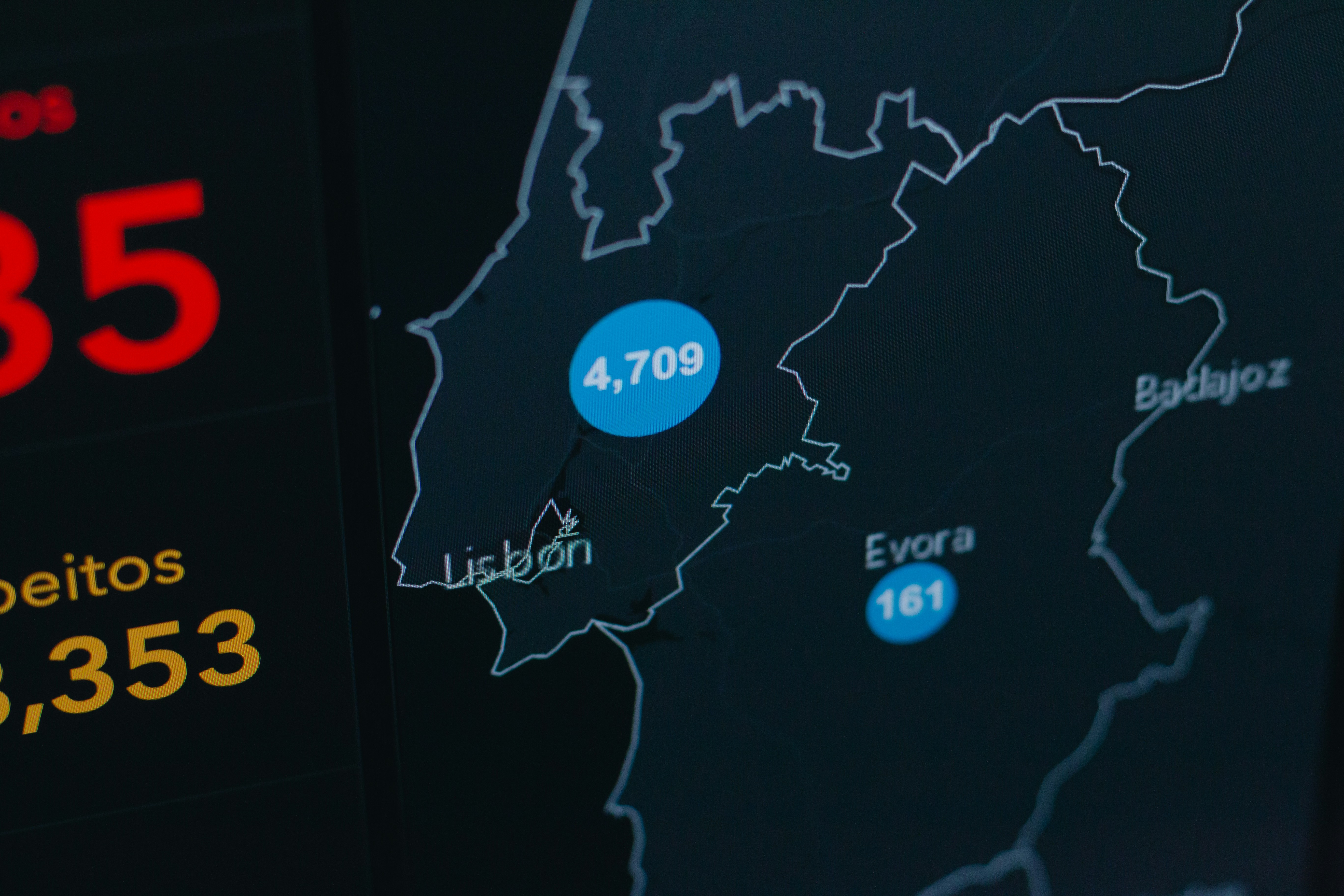
Orders Summary Panel: Displays recent orders, geographic data, and key metrics like completed vs. abandoned carts.
Products Overview Panel: Highlights most popular products, categories, and rising/falling trends.
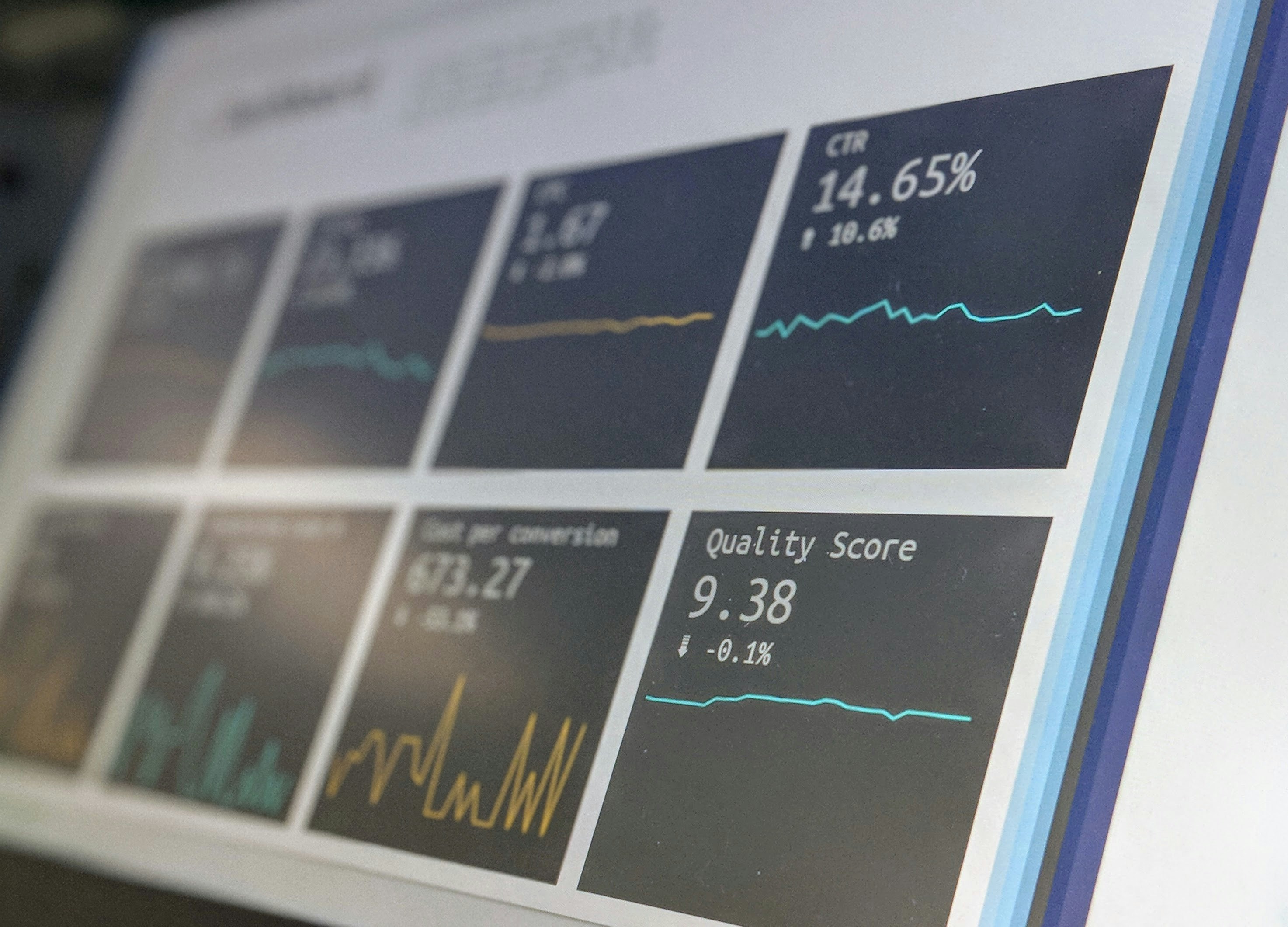
Marketing Campaign Insights Panel: Provides data on campaign performance across platforms, including impressions, clicks, CTR, and bounce rates.
Customer Insights Panel: Analyzes traffic sources, session duration, and purchasing behavior, comparing new vs. returning customers.
Design Highlights
Data Visualization: Used line charts, bar charts, pie charts, and maps to make complex data visually accessible.
Customizability: Designed dynamic widgets and filters for users to personalize their dashboard view.
Accessibility: Ensured WCAG compliance with high contrast, readable fonts, and keyboard navigation support.
Responsive Design: Optimized the dashboard for desktop and tablet usage, ensuring seamless transitions between devices.
Outcomes
Improved decision-making efficiency for users, with 80% of usability testing participants completing tasks faster than expected.
Positive feedback from stakeholders on the clarity and usefulness of data visualizations.
Reflection
This project highlighted the importance of user-centered design in creating tools for complex data analysis. Balancing functionality and usability was a rewarding challenge, and the insights gained from user research and testing helped craft a dashboard that is not only visually appealing but also highly practical.
.png)
.png)

.png)
.png)
.png)
.png)
.png)
.png)
.png)
.png)
.png)
.png)

.png)
.png)
.png)
.png)
.png)
.png)
.png)
.png)
.png)